Case Study
SONIC Drive-in Mobile Order Experience
Project type:
iOS and Android App
Year:
2016 – 2018
Project Overview
The U.S.-based quick service restaurant SONIC Drive-in approached R/GA to create brand new mobile ordering as additional functionality to their existing mobile application. Before we started the project, the app had limited features such as mobile payment using a prepaid card, browse the menu and check nutrition information. To create ordering experience optimized for mobile, we needed to come up with new information architecture, user flows, and interaction models.
My Role in this Project
Experience Audit
Competitive Research
Information Architecture
Define Logic Flows
Screen Designs
Create and Maintain UI Library
Usability Testing
KEY CHALLENGE
How can we make the customization steps feels like a fun experience, not a task?
In-store phisical menu
What makes SONIC Drive-in separate from its competitors is the number of customization options they offer to the customers. Nearly all items on the menu can be modified, and there are thousands of possible drink combinations customers can order.
To accommodate this existing offline customer behavior within new mobile ordering app, I needed to make sure that the app presents all necessary UI elements to users while not overwhelm them with options and steps.
Throughout the project, I made sure to create clear information architecture within the menu feature, provide just the right number of actions at a time and incorporate micro-interaction to let users flow through the ordering process.
STEP ONE
Look within. Look Around. Look Beyond
I began the design process by assessing the current experience both on mobile app and in-store, as well as studying how competitors are providing the similar experience and gathering inspiration for our interaction model by looking at out-of-category apps.
Competitor Analysis - Field Research
Through the field research, we found that customer tends to stick with their usual order and don’t often experiment with customization options especially when there is a line behind them. This insights later helped us to convince the client to include quick reorder feature and the design decision to include UI elements that make customization more discoverable to our app.
Competitor Analysis - Mobile Order Experience
Competitor analysis gave us some insights into how others are using mobile apps to facilitate ordering experience online and what experience pitfalls might occur. Although there was no clear winner in the category, we were able to set the baseline of mobile order experience through this process.
Out-of-category
After the audit, I synthesized our findings and defined the experience design approach for the menu section of the app.
STEP TWO
Getting Deeper
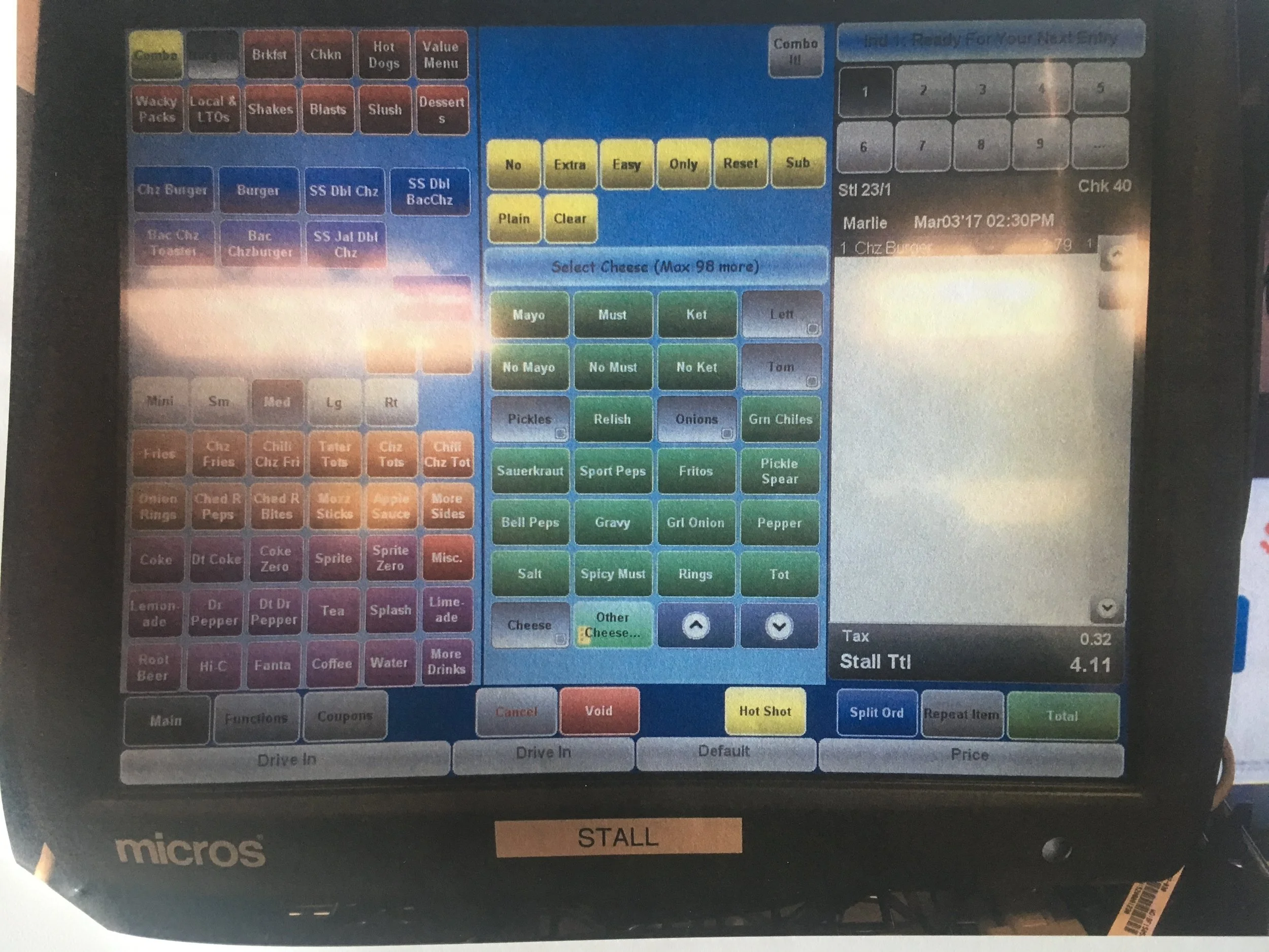
To design screens that accommodate Sonic's vast amount of customization options, I looked into the existing menu structure, user's order pattern data and user interfaces currently used by store operators. This process of deep diving process into SONIC's unique challenge helped us create new menu categorizations and grouping of customizable add-on items.
STEP THREE
Design. Test. Refine.
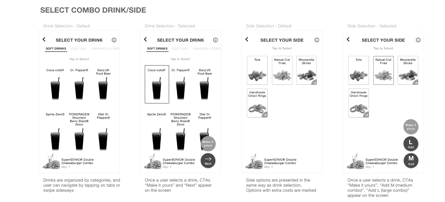
Once I finished just enough research, we started designing information architecture and user interfaces. As for most of the project that I work on, I started with paper sketch to explore different options quickly, then continue iterating idea by incorporating findings from user testing and feedbacks I received from SONIC's mobile product owner.
Initial explorations for the information architecture and UI
Use prototypes and wireframes to test the design
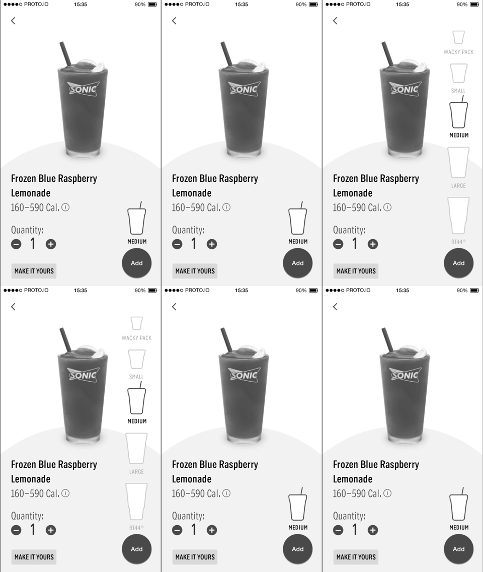
We quickly discovered our initial UI approach was requiring all users to go through too many screens to complete order regardless of if the user needs to customize item or select drink size other than regular. Through a few rounds of user testing, we found the solution that allows users to complete the majority of steps within one screen while not letting users with no need for customization to add an item to order by just one tap.
Prototype used to validate size selection UI
Refine screen design for the development
As we continue to refine the design, we incorporated brand colors to emphasize necessary screen changes, created highlighted state for each element to indicate user selections and other elements necessary elements to support business rules provided by SONIC HQ's store operation team.
STEP FOUR
Putting the Design in Front of Users
Throughout the design and development process, we incorporated usability testings. Because of the limited resources and project budget, I was only able to conduct in-person moderated testing with colleagues from R/GA. For testing sessions with external users, I've created discussion guides for the client's customer insight team and instructed how we would like them to run the testing sessions and collect user insights.
Images from in-person user testing at a SONIC location in Austin
Conclusion
This project gave me an opportunity to oversee a product design project from its definition to the launch. I have learned that to produce something good; you have to be patient, proactive, persistent and persuasive. Throughout the project, I received support from my team members — other designers, developers, software engineers, product owners, and more — as well as challenging feedbacks. These challenges trained me to look at my design from their perspectives and anticipate potential design pitfalls early on. I am proud that I was able to be a part of the significant milestone of SONIC's history and created the new way to experience SONIC for their fans nationwide.
Thank you so much for reading.


